“Illustration provides a great opportunity to communicate because it abstracts an idea,” says the creative director Steve Peck, who has worked behind branding campaigns for big organizations including Apple, Dropbox, and Samsung. “It allows you to exaggerate your expression in effective ways and provides room for interpretation and imagination, which can make your message more powerful.”
Technology brands are experimenting and keen on standing out. A brand illustration gives a business the ability to portray its brand story with consistency on various platforms (website, social media, etc).
Airbnb has embraced illustrations in branding and content efforts, for example with graphic designer Andrea Nguyen as the artist behind many of the content marketing attempts- Its GIFs, infographics, and product illustrations are wonderfully helpful, educational videos for new hosts – all the more engaging.

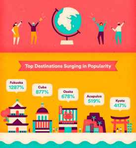
The connection between brand and illustration helps create a more memorable instance of a product or service which stands against the competitors and offers a better user experience.
Headspace
Most people who are looking into meditation or mindfulness are searching for a solution to their problem— fatigue, lack of creativity, anxiety, or stress.
Headspace has created a friendly, accessible look and feel for its brand, so it can sell the end goal of happiness.

Highlighting their benefits over features, their animated videos are high-spirited and point out how it comes in handy in our everyday routine.
Headspace Twitter
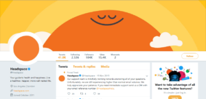
That’s why the brand’s video content, social posts, and blog visuals all feature its unique variation of illustrations and animations. Instead of relying on straight photography, most blog posts are paired with illustrations, collages, or GIFs as hero images. The variety within the designs keeps the eye moving and draws a visitor’s attention and curiosity.
Mailchimp
You won’t miss Mailchimp‘s illustrations in a hurry; partly due to the impressive bright shade of yellow they have embraced, and due to the hand-drawn nature of the images themselves.
The sketchy style, goes hand-in-hand with the brand’s mission to make email marketing as quick and easy as possible for its subscribers.

It is clear to see that Mailchimp has made a huge effort to carry this styling through to their other marketing channels, which gives the brand a consistent voice.
Google is currently the World’s most valuable brand. Google Web Search, Google Chrome, and Google Maps are a part of our day-to-day life and it’s hard to imagine life without this company.


Besides the doodles, Google also uses illustrations to promote its products while sticking to its vibrant color scheme.
Few Other honorable mentions


- Shopify

- Dropbox

- Kayako

- Salesforce design lightening system

- Atlassian

Will Illustration Work For Your Brand?
If you consider illustration for your brand, begin with recognizing your brand’s core values, message, and target audience. With any brand, once you have clearly articulated your mission, the rest of the strategy starts to take shape.
Finding the right way to express the brand’s mission and values is the crucial next step.
The important thing is to go with the flow and be willing to experiment.
A brand is a promise. More and more, illustration is being used to express brand value, specifically on the web.
Last but not least? The element of surprise – as well as benefit. The path to a brand illustration that is both meaningful and enduring is paved by experience, instincts, a solid grasp of the brand, and good old-fashioned hard work.










Leave a Reply